Top 6 Design Trends in Commercial and Architectural Signs

Introduction
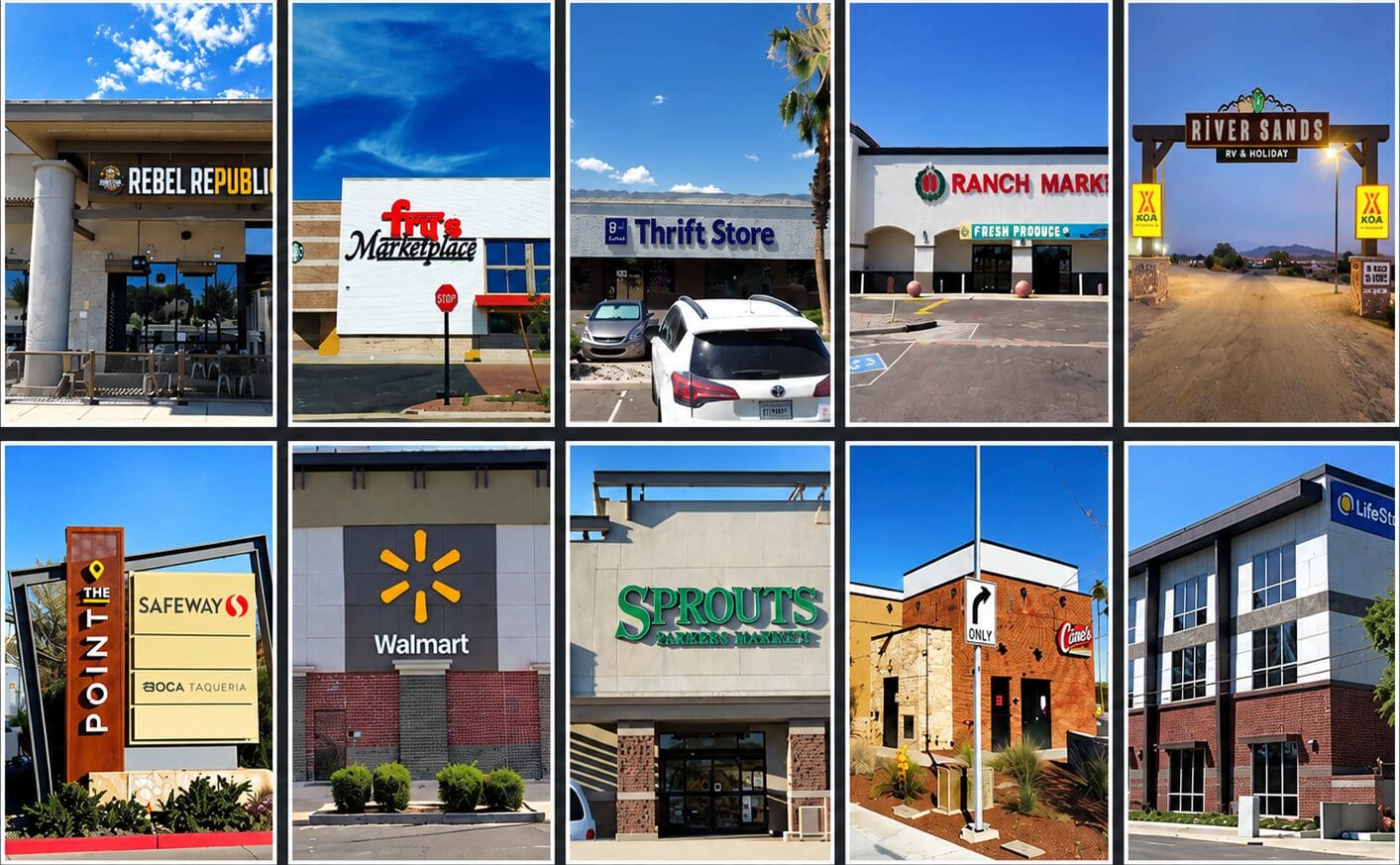
Signs have changed quite a bit over the years. Some styles come and go, some come back around, and some things always seem to work.
Lately, we’ve been seeing customers go a little cleaner with their signs. I don’t mean boring or plain. There’s just less going on, and the things that are there have a little more room to do their job.
Here are six trends we’re seeing in commercial and architectural signs right now.
1. Keeping It Simple
This is probably the biggest one. A lot of businesses are getting away from cramming too much into a sign.
We’ve all seen signs with three colors, two phone numbers, a website, a slogan, a list of services, and a logo squeezed in there somewhere. Most people driving by aren’t going to read all of that. They may not read any of it.
If somebody is passing your building at 45 miles an hour, they need to figure out who you are pretty quickly. A good logo, readable letters, and enough contrast will get you a long way.
The International Sign Association includes size, angle, location, lighting, and contrast among the main factors affecting sign visibility. That sounds technical, but the basic idea is pretty simple. Make the sign easy to find and easy to read.
2. Halo-Lit Letters
We’ve been building halo-lit letters for years, so they definitely aren’t new. They have become more popular lately, especially on buildings with cleaner architecture.
With halo-lit letters, the LEDs shine out the back of each letter and reflect off the wall. At night, that creates a glow around the letters or logo.
It’s a nice look when it fits the building. It’s softer than a bright face-lit sign, and it can give the letters some depth without making the whole storefront glow.
The wall surface has a lot to do with the finished appearance. Smooth stucco, stone, brick, and metal panels all reflect light differently. We look at the wall before recommending the letter depth, spacing, and LED color.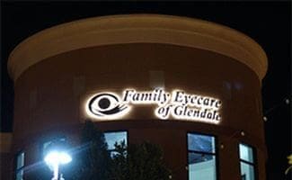
3. Mixing Different Materials
We’re also seeing more customers mix materials instead of making everything match exactly. Metal, acrylic, stone, wood-look finishes, and different textures can all work together.
Monument signs are a good example. Years ago, a lot of monuments were basically a sign cabinet sitting on a plain base. Now we’re often pulling colors, shapes, and materials from the building so the sign looks like it belongs on the property.
There’s a point where this can get out of hand. Once you start adding four or five materials, several colors, multiple lighting styles, and a digital display, the original idea can get lost.
We usually prefer choosing a couple of materials that work well together and letting them do the work.
4. More Natural Colors and Finishes
Black is still everywhere, and we don’t think it’s going away anytime soon. We’re also seeing more bronze, brushed metals, wood tones, stone finishes, and warmer colors.
There are better options now for getting the look of wood or another natural material without putting something outside that will need constant maintenance. That’s especially useful here in Arizona because the sun is hard on everything.
A finish may look great when it leaves the shop and still be the wrong choice for long-term outdoor use. We think about fading, heat, dust, water, cleaning, and how easy the finish will be to repair later.
We like natural-looking materials, but they still have to survive the property they’re going on.
5. Making the Sign Fit the Building
This is something we talk about with customers all the time. You can have a really nice sign that simply doesn’t look right on the building.
The size of the wall, architecture, colors, viewing angle, and distance from the road all affect the design. A sign that looks good by itself on a drawing may feel too small, too busy, or out of place once we show it on the actual building.
Sometimes a large wall calls for something with more depth or stronger lighting. A smaller storefront may look better with a simple set of channel letters. The sign should feel like it was designed for that location.
This is one reason we spend time on site surveys and scaled drawings. Guessing from a photograph usually isn’t enough.
6. Better Lighting, Not Just More Lighting
LEDs have given us more lighting options than we used to have. We can build bright face-lit letters, soft halos, combination-lit letters, illuminated cabinets, and signs with different color temperatures.
That doesn’t mean everything needs to be as bright as possible. A sign can be bright enough to light the parking lot and still look terrible.
The lighting needs to be even, readable, and suited to the building. Bright spots, dark areas, and mismatched colors are usually the first things you notice when an illuminated sign isn’t built correctly.
Sometimes face-lit letters are the right answer. Sometimes a softer halo looks better, and sometimes we combine the two. We look at the road, the wall, nearby lighting, and how the business needs to be seen after dark.
Don’t Design Around a Trend
Trends are fine. We refer to them all the time, and there are some really good-looking signs being built right now.
I wouldn’t design a sign around a trend just because everybody else is doing it. Most businesses are going to live with their sign for quite a few years. You want something that looks good now without looking dated five years from now.
Keep it readable. Use good materials. Make sure it fits the building and can handle the Arizona sun. The rest is figuring out what looks right.
At Bootz & Duke, we’ve been designing and building commercial signs in Arizona since 1964. If you’re planning a new sign or updating an older property, contact Bootz & Duke or request a free quote. We’ll look at the building, talk through the options, and tell you what we think will work.
Related Articles